Self-Identification
When considering the many facets of identity and the ever-expanding list of terms and options one can use to convey that identity to others, it quickly becomes apparent that, at least visually, there's no succinct way to express oneself.
As an exploration, I set off to figure out if there's a way to represent an individual's multifaceted identity in a clear-cut, visual way. By building a combinatoric symbol system which accounts for various aspects of identity, forty-five symbols could easily be generated, representing forty-five possible people and their gender + sexual identity.

The culmination of the initial exploration consisted of a symbol system and forty-five symbols generated using the system.
Concentric circles represent a person, irrespective of any external influences. Each ring consists of three sectors which can be filled in; depending on which sector(s) is filled, a different mode of self-identification is expressed. The innermost ring represents gender identity, the second represents physical, immutable sex, and the outermost ring represents gender expression.
The lines stretching out from the rings represents attraction, utilizing the split-attraction model which differentiates between sexual and romantic forms of attraction. The symbols affixed to the end of these lines determines what kind of person the attraction is aimed toward. The lines stretching out from the second ring represent sexual attraction; the lines stretching out from the third ring represents romantic attraction. Doubled lines denote polyamory of some sort (polysexual, polyromantic attractions).
Self-Identification, Redux
It was brought to my attention pretty soon after this exploration was completed that the complexity of the construction of the symbol system is a significant obstacle in the usability of the symbols. It’s easy to draw ♀ and ♂, but hard to draw the symbols I created. It was then that I recognized that the earlier exploration had become a logic-based formal exercise, distanced from the context of the problem it was geared to solve.
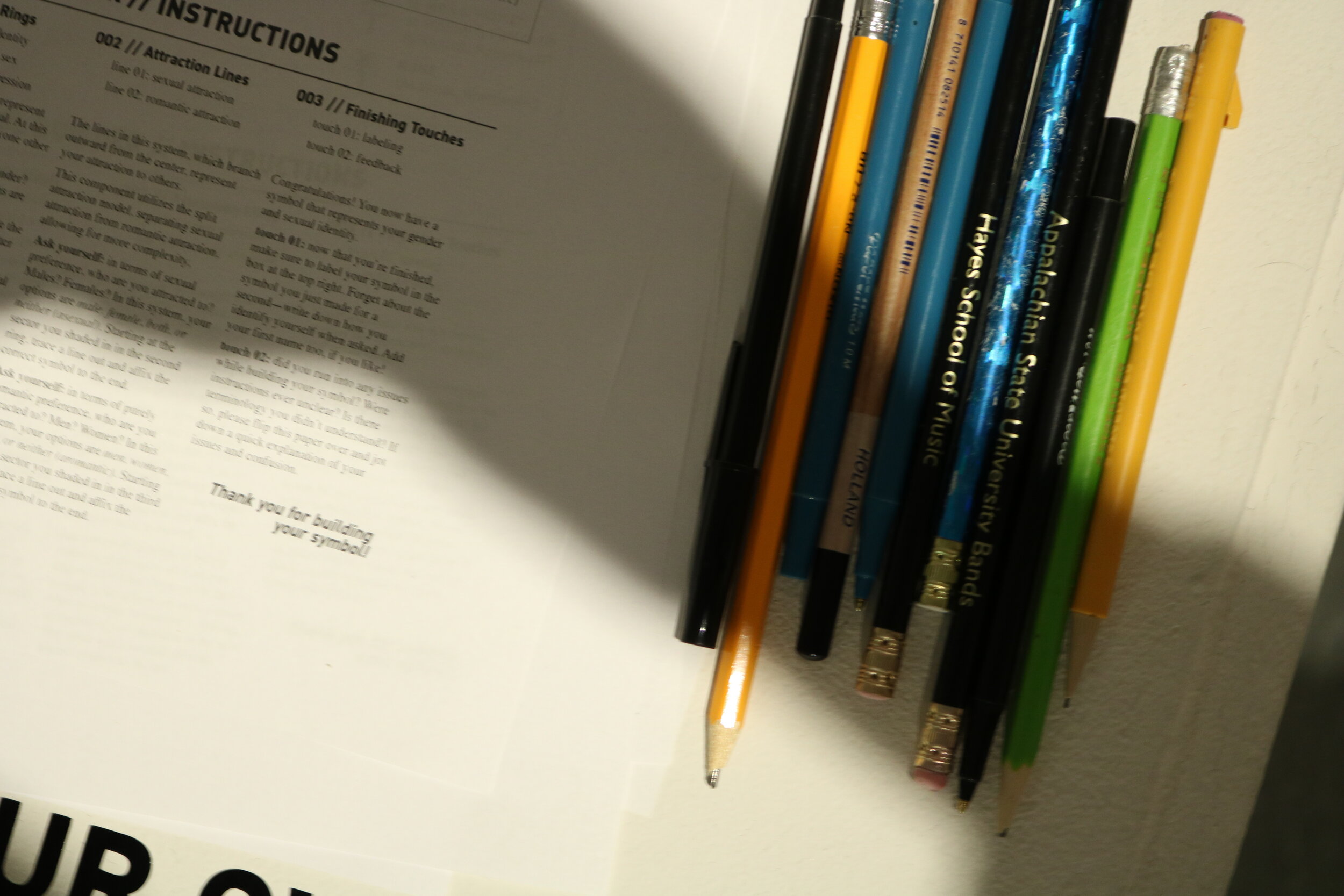
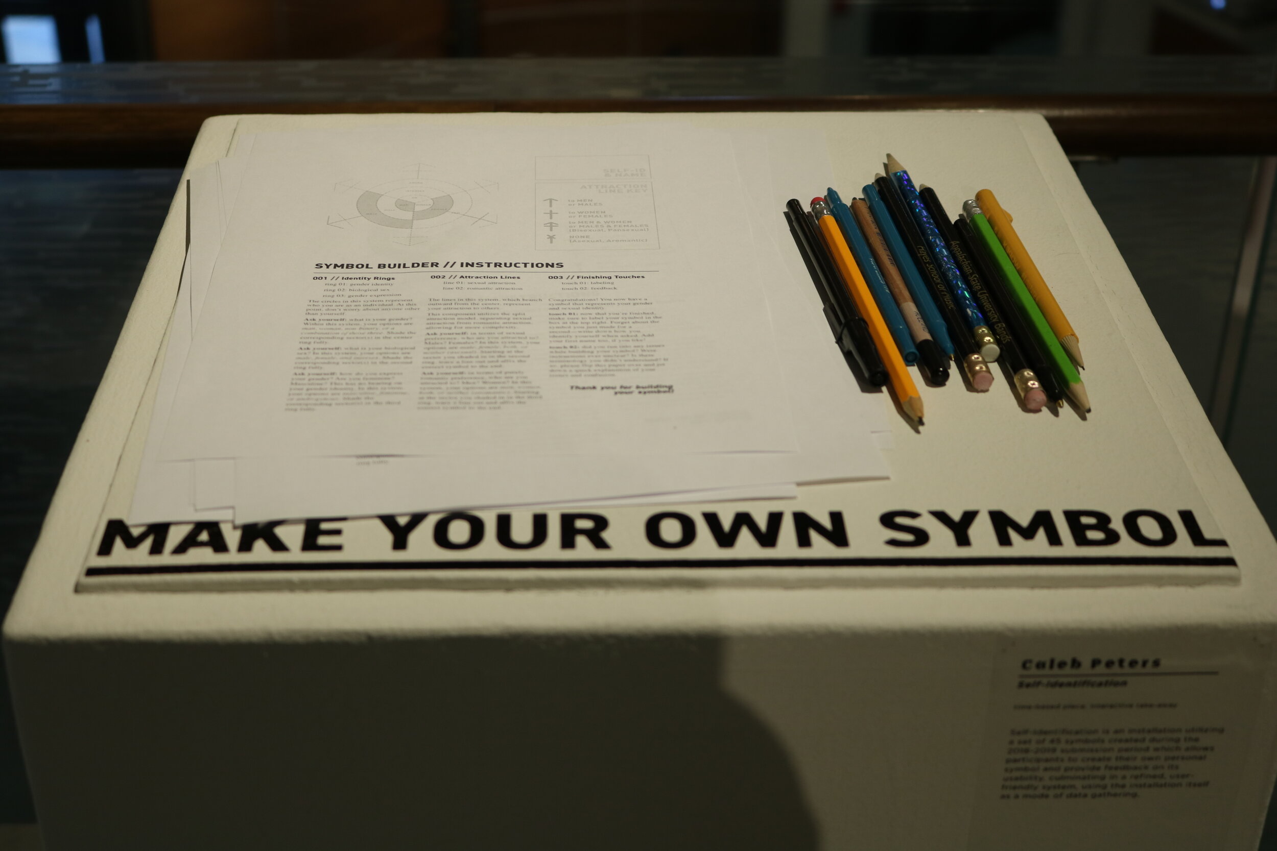
With the senior exhibition coming up, I decided to use it as a mode of feedback gathering before returning to the system and making changes. I developed a motion graphic showcasing the symbols and giving some background, as well as an analog symbol builder on which participants could draw their symbols and leave feedback on the system. Once they were finished, they’d drop their symbol in a box, and I’d use their attempts and their feedback as a data when returning to the system for improvements.


Eventually, after many trials, I settled on using Korean Hangul as a framework for the new symbol system. The vertical line and those attached to it are representative of gender identity, physical sex, and gender expression, while the other half represents sexual and romantic attractions. This new system allows for ease of use—it’s all linework, and requires nothing be colored in—and accounts for some of the inadequacies of the original system by using language of “hetero” and “homo” when referring to directional attraction rather than specifying what kind of person that attraction is directed toward. This also allowed for easier differentiation between bisexuality and pansexuality.
This system is also far more digestible in use, as formal orientation isn’t a consideration when reading it, and as linework is far more easy to draw and use.


